IM2440 User Centered Interface Design

This course provides students with the skills to design interactive interfaces. Emphasis is placed on examination of the information architecture, communication and business goals, media and delivery platform. Students will develop an interface prototype that meets the goals of the project. (Course Prerequisite: GD1420 Image Manipulation)

Syllabus and Meeting Times

This course provides students with the skills to design interactive interfaces. Emphasis is placed on examination of the information architecture, communication and business goals, media and delivery platform. Students will develop an interface prototype that meets the goals of the project. (Course Prerequisite: GD1420 Image Manipulation)

Instructor: John Keston

Meeting Times and Location Section (M/W):
Session 1 / Session 2
M/W 11am – 2pm (with appropriate breaks), Room 305, Pence building

Syllabus:
IM2440 User Centered Interface Design Syllabus

Required Reading:
Don’t Make Me Think (second edition) by Steve Krug

Recommended Reading:
Designing with the Mind in Mind

Week 1 | Week 2 | Week 3 | Week 4 | Week 5 | Week 6
Week 7 | Week 8 | Week 9 | Week 10 | Week 11

Week 1

Session 1: Today we will start by introducing ourselves and discussing the goals of the class. User centered interface design (UCID) is an established field that has evolved from user-centered design (UCD) concepts including use cases which have been in use, particularly in software development, since the early 1990s.

Reading:
User-Centered Design Encyclopedia Chapter
Google Glass

Session 2: Today in class I will briefly describe the reading assignment and discuss the requirements for the first concept summary. All writing assignments should be formated using MLA (Modern Language Association) 7. Also review the Purdue OWL MLA Guide.

Here are a few discussion points from the reading:

• Make it easy to determine what actions are possible at any moment.

• Make things visible, including the conceptual model of the system, the alternative actions, and the results of actions.

• Make it easy to evaluate the current state of the system.

• Follow natural mappings between intentions and the required actions; between actions and the resulting effect; and between the information that is visible and the interpretation of the system state.

Concept Summary #1: User-Centered Design Encyclopedia Chapter
Due: Week 2, Session 2 (at the beginning of class)

Write a one to two page concept summary of the User-Centered Design Encyclopedia Chapter assigned on Week 1, Session 1. Pay particular attention to the involvement of users in the design process.

1. Use MLA 7 format for your summary and works cited.
2. It is acceptable to quote the reading, but at least 80% should be in your own words.
3. Avoid platitudes or clichés like “very” or “everything happens for a reason”.
4. Bring in a stapled paper copy on the day it is due.

Assignment 1: Photo examples of good/bad UCD
Due: Session 1, Week 2 (at the beginning of class)

Take photographs of six examples of good and/or bad examples of UCD that you use regularly. Do not include software (i.e. no mobile phones, game consoles, or computers). Also, include multiple examples that are not electronic devices. Be prepared to show and discuss your examples as they relate to the concepts presented in the reading assignment. Place the photos in a folder on the drop off drive under /John Keston/IM2440/<Last, First>/Assignment 1/ before class on Week 2, Session 1.

Week 2

Session 1: Please be prepared to present your six photographs of user-centered (or not so user-centered) objects.

Reading for next week:
Chapters 1 – 5 of Don’t Make Me Think (second edition) by Steve Krug

Recommended Readings:
The “Design” of Web Design

Concept Summary #2: “Muddling Through”
Due: Week 3, Session 2 (at the beginning of class)

Write a two to three page concept summary of chapters one through five from Don’t Make Me Think. Be careful to include a discussion of topics from each of the chapters assigned. Discuss the importance of clear visual hierarchies, conventions, breaking pages into clearly defined areas, making what’s clickable clear, and minimizing noise.

1. Use MLA 7 format for your summary and works cited.
2. It is acceptable to quote the reading, but at least 80% should be in your own words.
3. Avoid platitudes or clichés like “very” or “everything happens for a reason”.
4. Bring in a stapled paper copy on the day it is due.

Session 2: Today please have stapled paper copies of Concept Summary #1 ready to turn in. After discussing the reading, we will discuss the final requirements and presentation date for the research paper project, otherwise known as assignment 2. Although it is only the second assignment it will not be due until mid-term. This will give you time to select a topic and collect research materials before beginning the writing process.

Assignment 2: Research Paper (20 points)
Due: Week 7, Session 1

General Terms and Principles
Research and Use the following terms as related to interactive design in your paper:
Usability
Heuristics (identify at least three key user centered design heuristics)
Accessibility
User Centered Design

Define and discuss one topic in the world of User Centered Design. Research until you find a topic that interests you. Use visual examples in your presentation (saved on Drop Off drive).

Your paper should be a minimum of five pages long, double-spaced, and contain a minimum of three visual examples. Cite your sources on a separate “Works Cited” page. Professional presentation of your work both written and oral is expected. Layout, typographic, and grammatical rules will be considered in your final grade (use MLA 7). Turn in a printed copy and a .doc version to the class drop off folder. The .doc file should be titled with your name and placed in the following folder:

Drop Off/John Keston/im2440/<Last, First>/Assignment 2/LastFirst_research.doc

Competencies
Identify interface design heuristics
Define an interactive design approach
Write a design concept note
Design interface prototypes using appropriate production tools
Develop a production plan for the interface design

Your work will be evaluated on the professional presentation, college level writing, meeting requirements, use of terms, subject matter, and design.
Week 3

Hansel and GretelSession 1: Let’s start today by discussing the reading assigned last week. Be prepared to talk about key concepts in the book. I will also be returning last weeks papers to you with my feedback and your grades. In class we will discuss MLA 7, grammar, and the purpose of a concept summary.

Smashing Magazine’s Showcase of Web Navigation

Concept Summary #3: “Designing Navigation”
Due: Week 4, Session 2 (at the beginning of class)

Write a two to three page concept summary of chapter six from Don’t Make Me Think. Be careful to include a discussion of each key concept from the assigned chapter. To name a few, discuss the following: the purpose of navigation, conventions, sub-navigation (secondary, tertiary, etc.), persistent or universal navigation, page titles/name, and so on.

1. Use MLA 7 format for your summary and works cited.
2. It is acceptable to quote the reading, but at least 80% should be in your own words.
3. Avoid platitudes or clichés like “very”, “mainly”, or “now I feel like I understand”.
4. To receive credit, bring in a stapled paper copy on the day it is due.

Session 2: In class today I will be presenting our next assignment. This exercise involved organizing topics into persistent, secondary, and tertiary navigation. I will present you with a web site concept and it will be your responsibility to organize the topics into a user-centered navigation scheme.

Week 4

Session 1: Let’s look at the requirements for the next project titled “Road Map.” The purpose of the “Road Map” project is to organize a list of topics for a hypothetical website. The model that we have chosen is a restaurant. Restaurants have a long list of areas that they want their customers to be aware of. This gives us an excellent prototype for formulating a user-centered navigation scheme.

Assignment #3 “Road Map” (15 points)
Due: Week 5, Session 2 (Beginning of Class)

Organize a minimum of twenty of the following topics into a complete navigation system that includes primary (universal or persistent) navigation, secondary (sub) navigation, and tertiary (sub-sub) navigation links. Start by creating a flow chart that shows where each topic is located. Next build a wireframe that illustrates how a typical page layout might be organized based on your navigation scheme. Draw from the reading (especially chapter six) and look at other restaurant websites to gather ideas. Use Adobe Illustrator or a free online tool that is made specifically for charting, like Lucid Chart to create the documents.

About Us
Beer
Birthdays
Breakfast
Calendar
Catering
Contact Us
Dinner
Drinks
Employees
Happy Hour
Home
Hours
Jobs
Location(s)
Lunch
Menu
Nutrition
Parking
Photos
Press
Reservations
Reviews
Shop
Social Media
Soft Drinks
Specials
Sponsorships
Vegetarians
Wine

Presentation:
On the day that the project is due place both documents in your folder on the drop off drive before class starts. During your presentation show how you organized the navigation items and demonstrate how your layout contributes to the navigation scheme. Show at least two websites that you studied to develop your ideas.

Resources:
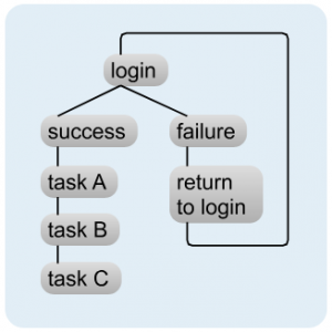
Example of a Flow Chart for Site Navigation
A Typical Wireframe for a Web Design
Lucid Chart – Free online flow chart software

Concept Summary #4: “Designing the Home Page”
Due: Week 6, Session 2 (at the beginning of class)

Write a two to three page concept summary of chapter seven from Don’t Make Me Think. Be careful to include a discussion of each key concept from the assigned chapter. To name a few, discuss the following: the purpose of navigation, conventions, sub-navigation (secondary, tertiary, etc.), persistent or universal navigation, page titles/name, and so on.

1. Use MLA 7 format for your summary and works cited.
2. It is acceptable to quote the reading, but at least 80% should be in your own words.
3. Avoid platitudes or clichés like “very”, “mainly”, or “now I feel like I understand”.
4. To receive credit, bring in a stapled paper copy on the day it is due.

Session 2: Today Concept Summary #3 is due. Please have stapled paper copies to turn in before class begins. During class, let’s discuss the concepts presented in chapter six. Be prepared to read from your paper and participate in a discussion regarding the key concepts presented in the reading.

Week 5

Session 1: No concept summary is due this week because of the “Road Map” assignment that is due on session 2. However, today is the required milestone for the “Road Map” project.

Assignment #3 “Road Map” Project Milestone
1. Illustrate which items you have selected for persistent navigation.
2. Show your wireframe document so far (with navigation)
3. Show your flowchart so far (include some secondary navigation)

Session 2: Will will start today with your “Road Map” project presentations. Do not forget to show your flowchart, wireframe, and a minimum of two research links.

Week 6

Session 1: Today is the first of two milestones required for the research paper. By the end of class please have an outline of your work so far including a detailed description of the area for your research.

Session 2: Please have paper copies of Concept Summary #4: “Designing the Home Page” for me by the beginning of class. We will discuss the key concepts from chapter 7 of Don’t Make Me Think. After our discussion please be prepared for your second research paper milestone described below:

Explain how your research involves UCID
Discuss the three UCID heuristics
Explain how accessibility is important to your example

Tips for Using Google for Research

Concept Summary #5: “Usability Testing”
Due: Week 8, Session 2 (at the beginning of class)

Write a two to three page concept summary of chapters eight and nine from Don’t Make Me Think. Be careful to include a discussion of each key concept from the assigned chapters. To name a few, discuss the following: the myth of the average user, focus groups versus usability tests, excuses for not testing, etc.

1. Use MLA 7 format for your summary and works cited.
2. It is acceptable to quote the reading, but at least 80% should be in your own words.
3. Avoid platitudes or clichés like “very”, “mainly”, or “now I feel like I understand”.
4. To receive credit, bring in a stapled paper copy on the day it is due.

Week 7

Session 1: Your research presentations are due today. Please turn in paper copies of your research papers. Support your presentation by showing the images that you found during your research. You may read from your paper, but it might be more suitable summarize the content of your research. Each presentation will require the following steps:

1. Present the concepts and ideas developed during your research
2. Show the images that you found regarding your topic
3. Defend your thesis during the feedback and discussions

Session 2: Let’s discuss the details about the next project.

Week 8

Session 1: Today we will discuss the next project which involves creating a minimum of three digitally produced mockups based on the work you did for your “Road Map” project.

Assignment #4 Restaurant Website Mockups (10 points)
Due: Week 9, Session 2 (Beginning of class)

Mockups are typically non-functional digital designs of web pages. Most designers build them in Photoshop or Illustrator. Mockups differ from wireframes in that they are complete designs featuring a logo, banner image, color scheme, specified typefaces, and content.

Create a minimum of three digitally produced mockups for one page from your “Road Map” project. Use what you have learned about UCID to create visible navigation, accessible content, and an overall useable layout. Pick a page that will contain a significant amount of content like home, about us, press, or reviews. Mockup the SAME PAGE three times in three different ways. The intent is to have a variety of design schemes to choose from or critique.

Mockup Resources:
The 960 Grid System
The 1140 Responsive Grid System
Comprehensive Guide to Mockup Design
Tips for Creating Mockups in Photoshop
Examples of Mockup Sketches

Session 2: Today Concept Summary #5 is due. Let’s discuss your concept summaries. Also, I am assigning our final concept summary for the final chapters in the book.

Concept Summary #6: “Usability and Accessibility”
Due: Week 10, Session 1 (at the beginning of class)

Write a two to three page concept summary of chapters ten, eleven, and twelve from Don’t Make Me Think. Be careful to include a discussion of each key concept from the assigned chapters. To name a few, discuss the following: the reservoir of goodwill, things that increase or decrease goodwill, skepticism regarding accessibility, fears of implementing accessibility, accessibility solutions.

1. Use MLA 7 format for your summary and works cited.
2. It is acceptable to quote the reading, but at least 80% should be in your own words.
3. Avoid platitudes or clichés like “very”, “mainly”, or “now I feel like I understand”.
4. To receive credit, bring in a stapled paper copy on the day it is due.

Week 9

Session 1: Mock project milestone / feedback. Please be prepared to show me your work on the mockups so far. For the milestone you should have at least one of the three designs completed.

Session 2: Today we will be presenting the mockups projects.

Week 10

Session 1: Today concept summary #6 is due. Please be prepared to discuss the key concepts from the reading in class. The rest of the time today we will cover the requirements for the final project. This project involves sketching out the functionality of a interactive application through a series of wireframes.

Assignment #5 Online Take-out Web Application Wireframes (15 points)
Due: Week 11, Session 2 (Beginning of class)

Use your understanding of user-centered interface design to outline the functionality of a web-based application for ordering take-out food from a restaurant. Write a one-page summary of the site’s purpose and features. Next design a series of wireframes (minimum of six) to illustrate the steps necessary for a customer to order and pay for take-out food. Use the landscape mode to design each wireframe to illustrate a desktop, laptop, or tablet computer screen. Take into account the possibilities of multiple menus, multiple item quantities, changes to the shopping cart, different billing versus delivery addresses, and user error.

Session 2: Today I will be reviewing your work so far on the web application wireframes. Please be prepared to show the following:

Assignment #5 Milestone #1
1. Prepare a rough draft of your application summary
2. Prepare at least three of your wireframes for review

Week 11

Session 1: Today is the last session to get feedback on your final projects.

Session 2: Final project presentations.